Monday, April 21, 2008

My Design Process

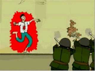
METAPHORICALLY PROJECTED

This was the simplest way to explain my design process successfully. By creating an extreme metaphor mocking out-dated technology shows that its necessary to make use of traditional methods for design. For those of you that weren't in class the day I presented or weren't awake enough at 8 in the morning to make sense of this. Maybe I've influence enough people to knock off this digital doodling crap in illustrator. Remember the pencil? Or at least Get a Pen and a Napkin.


Theory of Contemporary Design | with Heather Lowry

My Design Power

PART DEUX

Not only do we as designers have to power to promote but it's recently come to my attention anyone has the power to promote and make change. It's as simple as wearing a band t-shirt, your doing something to initiate potential
listener ship. I now have this sudden realization I might possibly have the power to bring back dead fashion trends with my own spin. I never said I wanted to be a fashion designer, but I'm sure I can incorporate some tie-die t-shirts into an ad. Corduroy pants, wallet chains, hell maybe I'll turn the yo-yo into a designer fashion statement. As we all know history just repeats itself when it comes to fashion and trends, so is it our decision as we mediate messages through design to set ideals such as fashion? I think so. I've always despised advertising because I don't like being told what I'm supposed to buy, but if you make the options look cool enough I'm not telling them to buy anything. Most of the time celebrities get to enjoy this power, but it's time for us designers to allow our designs to build ideals. Put Johnny Depp in a Canadian tuxedo and it might sell.


Jay Leno brings back the Canadian Tuxedo. Some dude sports the chain. And a psychadelic Band shirt from the Jay Johnson Band.


Red Communications

There's something about them...


I've said it before and I'll say it again. As technology makes it's progress, it is necessary for designers to have a thorough understanding of technological tools in order to have the extra creative design edge. Here is an amazing example of design making use of the latest greatest of mediums. Flash, Java, HTML, all major contributors to the coding based on developing a website. redcommunications.com is a prime example of all of this coming together to execute a quite amazing website. It's not just because Red is my favorite colour. As many web viewers these days love the eye candy this site manages to do it all, especially when they are selling their design work. I'm sold. The complete site functions as well as the form and uses various mediums to accomplish their online homestead.

Are Shreddies Better as Diamonds or Squares?


A genius campaign in my opinion. Shreddies has been a quite bunch as far as advertising goes for the past few years. To re-establish their market in the breakfast cereal industry they needed a campaign that would do exactly this, put the question in their head. Are they serious? It's design, sadly all it took was one person looking at the product in a different way. When people discover how simple the ad campaign they become a lover or a hater, and I must say the haters hate because of their lack of a sense of humour. It's about time a company mocked itself like this. I'm sure I'm not the first to blog about this, but I needed to spread the word of the new 'diamond Shreddies'.

Design in an Everyday Environment.

Everywhere and anywhere we see design. More and more everyday items are being designed around their function to enhance their form. It always makes an urban lifestyle more interesting when their is lots to look at. For example in the Queen and Spadina area in Toronto one is completely overwhelmed with graffiti, yet it really adds to the culture of that area, and also gives you so much to look at. Here's a good example of taking an everyday item and adding some fun to it via design. Especially if you're a Star Wars fan.

Sunday, April 20, 2008

The Tripadelic Psychoshow.

A.K.A The New Gnarls Barkley Music Video.


Last week I was watching some Saturday Night Live and the Musical performance was Gnarls Barkley who I wasn't too familiar with. I was highly impressed with the performance and song, so later the next day I you-tubed the music video. At first I wasn't impressed, but about half way through I was absolutely blown away with the attention to detail. I can't even explain the design because it's so spontaneous and exciting. Classical, yet extremely modern and ahead of the times. This generation must be the offspring of the hippies.


Please ignore the intro, totally pointless. But you have to watch the last half, sit back and respect the effort.
Gnarls Barkley - Run (2008)
http://youtube.com/watch?v=2GA3a15xF0c

Jörg Block

His name says it all. I've come across his work while perusing the internet and I'm in love with the style. The geometric composition meats a someone curious style. It quite reminds me of movie posters for Stanley Kubrick films such as Clockwork Orange and 2001 Space Odyssey. Very constructivist. Block is definitely some strong inspiration for myself and hopefully others. Here are a few of my favorite pieces from Block, but you MUST check out his website, it's quite amazing. http://www.joergblock.de/


Design. The Power to Mock.

trendsnow.net

With the abilities to design, and use modern design tools such as software we as designers have the power to construct our own opinions of brands and products by designing our own versions. Many make a living on t-shirts that mock brands, and many even to knock off designer brands. So many logos that exist already can easily be adapted to convey a different meaning, and they are always a good laugh.

Human Packaging

Someday in the future this will become useful. Perhaps for those who have a fear of flying, or seasickness. We can just freeze them and ship them where ever need be. Maybe even this is how you will maybe one day receive your clone in the mail.With a Styrofoam cut for the body it's just the simple. Such a sick world.


Trendsnow.net / Elric Petit

The Importance of the Ability to Maninpulate Various Styles.

After 2 years of design school I've yet to develop my own style, yet I'm told that is a good thing. One instructor told me, "if people can point out your design without knowing you designed it you've done bad design." Now I understand the importance of stepping outside and doing something different every time I design. Like my music the final execution is based on influences and inspirations from the past, by those who were revolutionary of their time. This is why studying history is important, you can't have an understanding of what your doing without knowing what has been done before. By incorporating various styles for my own and in the end I get a personally creative product. Heres a few examples from my hands:


A little Constructivist


A little Art Deco. Spindler was the wingman here.

Design in Film...

Animatronics v.s. 3D Animation

Over the years pop culture has been blessed with classic sci-fi experiences such as the Star Wars, Jurassic Park, and Harry Potter trilogies have been produced simply because of the outstanding special effects. With technological advancements we see constant improvements to special effects in film mainly with the help of Computer Graphics Interface (CGI) or Green screen such effects. Classic films throughout the 90's with huge budget would use Robotic Props or Animatronics, Model Building, and incredible set design making use large teams of designers in all sorts of fields to accomplish.


Since I was a child I've always wanted to design movie sets and props, a simple fascination. Now with CGI that hope was shot dead. As CGI progresses and the animations in film look more realistic I'm becoming more impressed but nothing still compares to a animatronics. Like who got to design the shark for Jaws? Or, who the costumes for the Ewoks from Star Wars? It's all design and has been taken to the computer and animated. Now Hollywood decides to make prequels to older movies such as Star Wars, Batman, Indiana Jones, special effects suit the period yet still don't ever match the originals. Why? Because nothing is as timeless as a large budget and almost realistic robots dressed to play the role. Not only is it easier for actors/actresses to act with the actual figures rather than a green screen, but creates more jobs for designers. This could be an essay, so I'll leave you with a few visual examples:


Here is an Ewok from Star Wars III Return of the Jedi.
One Hell of a costume!


A Animatronic Head from the making of Star Wars Episode I. How It should be done.

The Wonderful Animatronic T-Rex. Too bad it turns out they were smaller and had feathers.
What a disappointment.


The wonderful set design from the original Star Wars Film. The budget speaks for itself,
a classic film.

All images credited to imdb.com

Bringing Back the Wrist Watch?

Who would have thunk that the traditional wrist watch would go out of style. Lately I've been observing to see how many people still wear a wrist watch, and the outcome is quite surprising. Sunday afternoon the sun was shining, and I thought I'd tour Queen St. as an experiment and ask people what time it was, and make my observations based on the method they provided the time with. Believe it or not, but almost every single person provided the time by pulling out there cell phone. So why wear a watch right?

With design at our fingertips, we as designers must take it in to jump on the technology swing and bring back traditional objects through sick design. Here is an idea for a watch by designers Robin Lapo Bigio
and Olivero Zanon. The idea has been turned into a womens' fashion item but could have many uses beyond fashion. Perhaps bringing back the wrist watch.


Wednesday, April 16, 2008

How to Design an Olympic Logo

This was a piece se-mailed to me by my father. It's sad to say sometimes inspiration can come from the sickest of ideals. This piece is great, with the recent Olympic criticisms ans the situation in Tibet this is absolutely, fantastically necessary at all costs. This is titled, "How to design an Olympic Logo."


You can laugh if you'd like.


My Creativity and My Education

My Education via Humber College has taken my inner creativity to a whole new level. Humber has taught me how to develop an idea, and thoroughly execute that idea. Before college I was always being creative, trying to do as much as I could differently from anyone else, as well as building anything I thought of Now I find my creativity controlled and confident as I can now execute any idea that comes to my mind with a solid knowledge of the process and the tools used. One of the most important things that I've grown to become aware of is knowing what NOT TO DO in design. Knowing what to to is fantastic, but you have to know what not to do in order to break the rules. When the rules are properly broke the design has potential to be more creative than the competition.


Through an innovative idea to an innovative package I've drawn up ideas and eventually taken it to the computer. This 3D rendering is what I plan on executing soon. Stay Tuned.

Saturday, April 12, 2008

Typographic Innovation

With the constant development of modern design mediums such as 3d animation, flash, and the capabilities of projecting such on absolutely huge surfaces, designers must be aware of the creative potential. Lately some movies have been catching my attention due to creative usage of different design elements through modern design mediums.

In 2005 Hitchhikers Guide to the Galaxy many of the explanations of the universe are described through animations very similar to what is commonly found on flash websites. The colour schemes are phenomenal and the style is very 'iPod' like, but they are bloody awesome! If you follow the link you will see what I'm talking about.
http://www.youtube.com/watch?v=p4JhOC6QwJc&feature=related (Hitchhikers Guide to the Galaxy)

Another amazing intro I found while perusing YouTube was apparently designed by a student. In my opinion it is very well done and completely suits the style of the movie. The way letter forms transform into other letter forms via motion graphics is quite incredible. This is what we as designers need to be up on as Bob Dylan once said, 'the times are a changing.'
http://youtube.com/watch?v=KhY26_jXPVw&feature=related (Ocean's Eleven)

My Compliments to Cirilla the Killa.

Within the past week, Mike Cirillo and myself were chosen to collaborate our designs for Humber's latest Ensemble Album. At first I was skeptical about joining forces but after speaking with Mike, we came up with some solid solutions to our design problems. We both knew right then and there that we had 'one hell of a design' in our hands.

We both then worked with a designer outside of Humber to prep the file in order for mass production. Mike showed an extreme passion for what we had by taking the time to perfect the design. Also he was very professional throughout the very hectic ordeal. I could have been stuck with someone that has a brutal lack of professionalism, and the process would have been hell. Mike's confidence did nothing but boost my own confidence and in turn produced what we both believe will be one 'damn nice CD'. Cirillo deserves a massive props on this one. Good work design-brotha.


Here she be, you must visualize it folded first in half, then folded in 3. It's sexy. Eventually when we get our copies of it we will have nice pictures to show off. This version was still a rough version as well.

Mike Cirillo & Dan Mitchell 2008 | Typography 4

Wednesday, April 9, 2008

My Design Power


As mentioned in my last post I would like to inform the general public about the importance of music. With modern technologies music is now accessed, downloaded, shared via internet without any designed influence. Back when vinyl records were the primary source of music the design real-estate was massive, then moved to cassette tapes the surface got smaller. Then to CD's with various creative designed packages, and now, nothing. iTunes has made the effort to display artwork with the album artwork and cover flow features, so designers need to take advanatage. Cas Haley, made famous by America's Got talent was produced and promoted digitally before being sold in stores. I purchased his album from iTunes and received a full digital booklet, neat, yet booo. If the designed digital booklet was interactive and perhaps did fun flash like things that would educate the audience about influences, ideas, much like commentaries on DVD's design would be empowering the importance of music. It will be my generations responsibility to tackle this and be creative with the technologies provided.

visit CasHaley.com, well done design. It really revives the reggae culture through modern design. A well branded Figure thanks to America's Got Talent, but he is amazing.


courtesy of photo.munkey.net

My Manifesto

1. DESIGN
As a designer it is my obligation to preach the importance of design. In today's age you can't look anywhere without experiencing some form of design. Everything and Anything has been designed and many are oblivious to their designed surroundings.

2. HUMAN EXISTENCE

In order for the human race to strive for years to come, someone needs to spread the importance of healthy lifestyles and potential cures for deadly diseases. With the power of design I can inform those who chose to ignore the factors that lie against the human race.

3. MUSIC
With societies lack of religious beliefs these days people are turning to music for praise. Dead musicians are becoming figures as equal to those of religious figures and design has the power to develop a music culture stronger than ever. i.e. Classic songs, over 40 years old have been sampled and reproduced electronically, re popularizing classic musicians and restoring the heritage. With Design I can keep further generations informed of the extreme importance of music throughout the past.

4. TRADITIONALISM
In such a changing world due to modern technologies younger generations are forgetting the traditional ways of living their everyday lives. With design i can revamp memories of the rotary phone or the poodle skirt. Face it, history class sucks. Design is a much more fun way to learn.

5. ENVIRONMENTALISM
This is quite self-explanatory. Design has the power to make change, a good example is the billboards all over Toronto and television commercials with David Suzuki. Without environmentalism the water will just boil over the pot metaphorically speaking.

6. PEACE/LOVE
Much like Bob Marley preached about peace and love, a necessity to exist on Earth. With design I have the power to preach like Marley in a visual way that peace and love makes the world go round.

7. CANADIAN HERITAGE
Born Canadian and lived here all my life I'm proud to be a Canadian. With design I can embrace the patriotism and inform other Canadians the importance of understanding our heritage and keeping together as a Nation.

8. INDIVIDUALISM

Trends and Fads have been around since the beginning of brands. I believe that it's important to be an individual and create your own opinions about life rather than basing opinions on those you hear from, friends, peers, media.